Definition
Cards are surfaces that display content and actions on a single topic.
They should be easy to scan for relevant and actionable information.
Header image and button link are optionally, thus you can use the card without one of them.
But, if you are planning to use a card without image and without button, consider to use the box component
In some occasions, we may need cards with changes that go further than a simple variant. So, in order to avoid modifying too much the card, "special cards" come handy. For example, the "card excursion" at the bottom of this document.
Handlebars
Lorem ipsum dolor sit amet
Note that cards can also have subtitles
Lorem ipsum dolor sit amet, consectetur adipiscing elit, sed do eiusmod tempor incididunt ut labore et dolore magna aliqua.
Razor
Open in new tabYou can use the card with the flow button
Handlebars
Lorem ipsum dolor sit amet, consectetur adipiscing elit, sed do eiusmod tempor incididunt ut labore et dolore magna aliqua.
Razor
Open in new tabYou can use the card with the neutral button
Handlebars
Lorem ipsum dolor sit amet, consectetur adipiscing elit, sed do eiusmod tempor incididunt ut labore et dolore magna aliqua.
Razor
Open in new tabOr even the flat button.
Handlebars
Lorem ipsum dolor sit amet, consectetur adipiscing elit, sed do eiusmod tempor incididunt ut labore et dolore magna aliqua.
Razor
Open in new tabModifiers
The card can also have a label
Handlebars
Lorem ipsum dolor sit amet
Note that cards can also have subtitles
Lorem ipsum dolor sit amet, consectetur adipiscing elit, sed do eiusmod tempor incididunt ut labore et dolore magna aliqua.
Razor
Open in new tabVariants
The top title is used to make the title more visible and give more content to the card content.
Usually is used without a button
Handlebars
Lorem ipsum
Lorem ipsum dolor sit amet, consectetur adipiscing elit, sed do eiusmod tempor incididunt ut labore et dolore magna aliqua.
Razor
Open in new tabHowever, we need to make sure that even if a button is added, the title looks still fine.
Handlebars
Lorem ipsum dolor sit amet, consectetur adipiscing elit, sed do eiusmod tempor incididunt ut labore et dolore magna aliqua.
Razor
Open in new tabWithout the image, the title has a solid background.
Handlebars
Lorem ipsum
Lorem ipsum dolor sit amet, consectetur adipiscing elit, sed do eiusmod tempor incididunt ut labore et dolore magna aliqua.
Razor
Open in new tabCollections
Card component can also be "labeled" with a collection:
This is a "labeled card". Can be used inside a "collections context".
This is a "labeled card". Can be used inside a "collections context".
Special cards
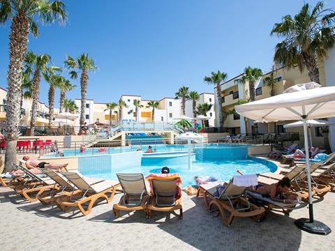
The "card price" is a type of card with enough differences from the original card to be considered as "special". Here is used to show the user an overview of the excursions available for an specific acco:
Handlebars

First Excursion
Razor
Open in new tabthe same card with price but with a compact view
The "card collection" is a type of card with enough differences from the original card to be considered as "special". Here is used to show the user the usp of every collection and two links, one to give access to more info about the collection and the other to show vacations of that collection.
The "card avatar" is a type of card with enough differences from the original card to be considered as "special". Here is used to show an avatar next to the title.
Handlebars
Doutzen Kroes
Holiday editorial Voyage Magazine
Vivamus facilisis scelerisque lectus at lacinia. Ut ac massa maximus, condimentum magna suscipit, hendrerit ipsum. Pellentesque commodo purus ut ligula convallis, sit amet maximus velit luctus. Morbi nec accumsan ipsum. Etiam sed enim nunc. In luctus mattis elit sit amet congue. Donec suscipit risus eget orci bibendum, a placerat ligula aliquet. Phasellus tristique mollis fermentum. Suspendisse eget porttitor felis.