Definition
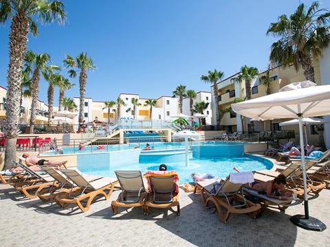
The collection row component is used to show a list of items with a picture to be an entry point for another page. The name is because was typically used to present collections on home pages. It can be used for this purpose or others as well.
By default it's displayed as row items, but they are expandable to actionable items with prominent image. The breakpoint where they expand can be configurable on certain cases.
Handlebars
Razor
Open in new tabThe collection row items can have a collection assigned, which change their style.
This visual styles could be applied only if the brand has theme color schemes.
A collection row could contain items with different collections.
Handlebars
Lorem ipsum
Dolor sit amet consecteur elit
Lorem ipsum
Dolor sit amet consecteur elit
Lorem ipsum
Dolor sit amet consecteur elit
Lorem ipsum
Dolor sit amet consecteur elit
Lorem ipsum
Dolor sit amet consecteur elit
Lorem ipsum
Dolor sit amet consecteur elit
Lorem ipsum
Dolor sit amet consecteur elit
Lorem ipsum
Dolor sit amet consecteur elit
Lorem ipsum
Dolor sit amet consecteur elit
Lorem ipsum
Dolor sit amet consecteur elit
Lorem ipsum
Dolor sit amet consecteur elit
Lorem ipsum
Dolor sit amet consecteur elit
Razor
Open in new tabVariants
Handlebars
Razor
Open in new tabHandlebars
Razor
Open in new tabHandlebars
Razor
Open in new tabHandlebars
Razor
Open in new tabHandlebars
Lorem ipsum
Dolor sit amet consecteur elit
Lorem ipsum
Dolor sit amet consecteur elit
Lorem ipsum
Dolor sit amet consecteur elit
Lorem ipsum
Dolor sit amet consecteur elit
Lorem ipsum
Dolor sit amet consecteur elit
Lorem ipsum
Dolor sit amet consecteur elit
Lorem ipsum
Dolor sit amet consecteur elit
Lorem ipsum
Dolor sit amet consecteur elit
Lorem ipsum
Dolor sit amet consecteur elit
Lorem ipsum
Dolor sit amet consecteur elit
Lorem ipsum
Dolor sit amet consecteur elit
Lorem ipsum
Dolor sit amet consecteur elit
Razor
Open in new tabModifiers
Handlebars
Lorem ipsum
Dolor sit amet consecteur elit
Lorem ipsum
Dolor sit amet consecteur elit
Lorem ipsum
Dolor sit amet consecteur elit
Lorem ipsum
Dolor sit amet consecteur elit
Lorem ipsum
Dolor sit amet consecteur elit
Lorem ipsum
Dolor sit amet consecteur elit
Lorem ipsum
Dolor sit amet consecteur elit
Lorem ipsum
Dolor sit amet consecteur elit
Lorem ipsum
Dolor sit amet consecteur elit
Lorem ipsum
Dolor sit amet consecteur elit
Lorem ipsum
Dolor sit amet consecteur elit
Lorem ipsum
Dolor sit amet consecteur elit